DEMAND FOR WAYFINDING signage has increased over the last several years.“Through our focus on higher ed and prep schools,the underlining need for wayfinding signage on these campuses is to improve the parent and student experience,”says Keith Davis,a technical design consultant with KRD Design(Chester Springs,PA).“As the cost of education increases,schools realize that they are competing for student enrollment and need to provide the best possible experience for the student,prospective students and their parents,which can separate them from the next school.”
在过去几年中,对导向标识的需求不断增加。"KRD Design公司(宾夕法尼亚州切斯特斯普林斯)的技术设计顾问基思-戴维斯(Keith Davis)说:"通过我们对高等教育和预科学校的关注,这些校园对导向标识的需求主要是为了改善家长和学生的体验。"随着教育成本的增加,学校意识到他们正在为招生而竞争,需要为学生、潜在学生及其家长提供尽可能好的体验,这可以将他们与下一所学校区分开来"。
Industry insiders agree that wayfinding signage will continue to be a key element for any building or campus looking to improve visitor experience.It offers a comfortable and seamless way for people to navigate the space with ease.While GPS will improve on mobile devices,static wayfinding signage will always have an important place in our society.
业内人士一致认为,对于任何希望改善访客体验的建筑或校园来说,导向标识仍将是一个关键因素。它为人们轻松浏览空间提供了一种舒适、无缝的方式。虽然全球定位系统在移动设备上会有所改进,但静态寻路标识在我们的社会中将始终占据重要地位。
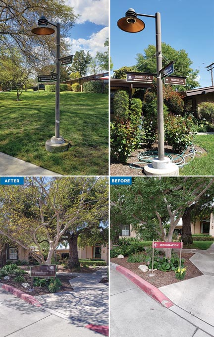
NEWLY MINTED:MSAG’s wayfinding signs feature a brown background,white text and mint-green borders.
新铸造:MSAG的指路标志采用棕色背景、白色文字和薄荷绿色边框。
THE RIGHT DIRECTION
正确的方向
When the Mt.San Antonio Gardens(MSAG),fondly known as“The Gardens”and a nationally recognized not-for-profit CCRC Life Plan Community,decided to refresh its 30-acre campus in Claremont/Pomona in Southern California,they reached out to A&I Reprographics in Ontario,CA.The management team at MSAG was seeking new,clean wayfinding signage to replace its aging and out-of-date signs,to create a look more aesthetically pleasing to the garden environment and to make campus navigation easier for senior adult residents and their guests.
圣安东尼奥山花园(MSAG)被人们亲切地称为"花园",是国家认可的非营利性CCRC生活计划社区,当它决定更新其位于南加州克莱蒙特/波莫纳的30英亩园区时,他们找到了位于加利福尼亚州安大略省的A&I Reprographics。MSAG的管理团队正在寻找新的、整洁的导向标识,以取代老化过时的标识,创造出更美观的花园环境,使老年居民和他们的客人更容易浏览园区。
“In our initial discussions with management in May 2023,they wanted a cohesive design concept for their wayfinding signs,”says Kathy Moylan,A&I’s president.“They wanted all of the signs to have the same typeface,same color scheme,same shape but smaller while including all of the necessary information.We proposed the arch design to accommodate the MSAG logo and the wayfinding information.MSAG loved the concept,so we created initial design proofs of each sign.”
"A&I公司总裁凯西-莫伊兰(Kathy Moylan)说:"2023年5月,我们与管理层进行了初步讨论,他们希望路标有一个统一的设计理念。"他们希望所有的标识都采用相同的字体、相同的配色方案、相同的形状,但尺寸要小一些,同时包含所有必要的信息。我们建议采用拱形设计,以适应MSAG徽标和寻路信息。MSAG非常喜欢这个概念,因此我们制作了每个标志的初步设计样稿"。
To complement the gardens,all of the wayfinding signage would have a brown background,white text and mint-green borders.Times New Roman was selected as the typeface for this project after several options were considered.
为了与花园相得益彰,所有的导向标识都将采用棕色背景、白色文字和薄荷绿色边框。在考虑了多个方案后,Times New Roman被选为该项目的字体。
A&I partnered with Gemini Sign Products to outsource the signage fabrication.Gemini cut,printed,coded and packaged the signage,which was delivered to A&I’s Ontario office.
A&I公司与Gemini Sign Products公司合作,将标牌制作外包。Gemini对标牌进行切割、印刷、编码和包装,并将其运送到A&I的安大略办事处。
To produce the signs,Gemini nested the artwork on¼-in.aluminum sheet and laser cut the designs.From there,the firm bead blasted the returns and stroke sanded the face before taking it to their paint area where the custom Matthews Paint MP3364 Doppelbock Brown was mixed and applied to the face,back and returns.Details were applied through the UV Colorlast process,an alternative solution for multicolor logos when a quality,cost-effective product needs to be delivered quickly.
为了制作标牌,Gemini将图样嵌套在1/4英寸的铝板上,并用激光切割设计。然后,该公司对回纹进行喷砂处理,并对表面进行打磨,最后将其送到喷漆区,在那里混合定制的马修斯油漆MP3364 Doppelbock棕色,并将其涂在表面、背面和回纹上。细节部分采用UV Colorlast工艺,这是一种在需要快速交付高质量、高性价比产品的情况下处理多色徽标的替代解决方案。
Before the new signage was installed,the existing signs had to be removed.Studs or posts were cut and grinded away,making way for a clean surface to drill and mount the new posts and signage.
在安装新标识之前,必须拆除现有标识。螺柱或立柱被切割和打磨掉,为钻孔和安装新立柱和标牌提供了干净的表面。
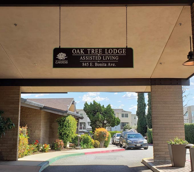
FORM&FUNCTION:Logo use reinforces the brand while clear copy directs residents and visitors.
形式与功能:标志的使用强化了品牌,而清晰的文字则为居民和游客提供了指引。
The new signs were installed on custom-made 2-in.square steel tubing with steel plates welded to the bottom and drilled to mount into concrete footings(existing and new).The installation team drilled each steel post to accept a threaded stud tapped into the back of the signs,then drilled the back of the posts to accept a nut-and-fit socket for securing the sign.Plastic caps hid the drilled holes after installation as well as the top of the tubing,which had a plastic cap to give it a clean,finished look.
新标识安装在定制的2英寸方形钢管上,钢管底部焊接有钢板,并钻孔安装到混凝土基座(现有基座和新基座)上。安装团队在每根钢柱上钻孔,将螺纹螺栓插入标志牌背面,然后在钢柱背面钻孔,将螺母套筒固定在标志牌上。安装完成后,塑料盖将钻孔和管子顶部遮盖起来,管子顶部有一个塑料盖,使其看起来整洁美观。
The team mounted each sign to a concrete base in planter areas along the property.They drilled the concrete footings and installed redhead concrete anchors to secure the new posts.Areas that did not already have concrete were dug and concrete bases were poured using Quikrete and round tube forms.The installers set the anchors in concrete and secured the posts to anchors after the concrete had fully cured.
施工队将每块标牌安装在地产沿线花圃的混凝土基座上。他们钻了混凝土基座,并安装了红头混凝土锚,以固定新立柱。在没有混凝土的区域进行了挖掘,并使用Quikrete和圆管模板浇筑了混凝土基座。安装人员在混凝土中设置锚栓,并在混凝土完全固化后将柱子固定在锚栓上。
The only challenges faced by A&I during installation were the lack of electric power to operate its equipment,the different widths apart of each footing on existing signs and the different mounting techniques on older signs.“We compensated by using a small generator for power and cutting the studs off of some signs or using a cutting wheel,”Moylan recalls.
A&I公司在安装过程中遇到的唯一挑战是缺乏操作设备所需的电力、现有标志上每个基脚的宽度不同以及旧标志的安装技术不同。"莫伊兰回忆说:"我们使用小型发电机供电,并将一些标志上的螺柱切掉或使用切割轮来弥补。
Once the MSAG project was completed in March 2024,its management team agreed that the signage seamlessly merged form and functionality,prioritizing accessibility and ease of navigation throughout the community.
MSAG项目于2024年3月竣工后,其管理团队一致认为,标识牌将形式和功能完美地结合在一起,优先考虑了整个社区的可访问性和导航便利性。
DRILLING DEEP
深入钻研
As one of the leading dental programs in the country,the University of Michigan School of Dentistry in Ann Arbor,MI attracts top-notch students,faculty and researchers to its three-story building and adjacent seven-story research tower.Even the general public is welcome to its on-campus dental operatory clinics and Sindecuse Museum of Dentistry.But administrators decided that the buildings needed a complete renovation after more than 60 years,including new wayfinding signage.
密歇根大学牙科学院位于密歇根州安阿伯市,是全美领先的牙科专业之一,其三层高的教学楼和毗邻的七层研究塔吸引着一流的学生、教师和研究人员。校内的牙科手术诊所和辛德库斯牙科博物馆甚至也欢迎普通公众参观。但管理者认为,在60多年后,这些建筑需要全面翻新,包括新的导向标识。
The team assembled for this project,known as Blue Renew,was the project architectural firm SmithGroup(Chicago);sign company InkSpot DESIGN Inc.(Chicago)to provide design and documentation;another signshop,Visual Entities(Wyoming,MI);and nationwide Clark Construction Co.Wayfinding took on greater importance amidst the changes to the school,which included the transformation of two entrances to the building,reorientation of patient clinics,enclosure of open courtyards that became research and faculty spaces,and the creation of new internal pathways.
该项目被称为"蓝色更新"(Blue Renew),项目团队由芝加哥史密斯建筑设计公司(SmithGroup)、提供设计和文档的标识公司墨点设计公司(InkSpot DESIGN Inc.)、另一家标识公司视觉实体(Visual Entities)(密歇根州怀俄明州)以及全国性的克拉克建筑公司(Clark Construction Co)组成。在学校的变化中,导向标识显得更加重要,这些变化包括改造大楼的两个入口、调整病人诊所的方向、封闭成为研究和教师空间的开放庭院以及创建新的内部通道。
“We decided to make the wayfinding signage prominent and clear,”says Jan McCarthy,owner and president of InkSpot Design.“We were directing people to elevators,patient registration,patient parking,clinic waiting areas,clinics,seminar rooms,faculty offices,the café,student labs and commons areas.Our goal was to produce clear brief messages,follow the geometry of the interior finishes,and use a neutral color palette for the signs including white,dark neutral tones and copper.Wayfinding needed to be positioned to be highly visible along pathways,especially at monument walls and elevators.Donor recognition could be incorporated into identification signage at clinic entries and other key destinations.”
"InkSpot Design公司的所有人兼总裁简-麦卡锡(Jan McCarthy)说:"我们决定让导向标识更加醒目和清晰。"我们将人们引向电梯、病人登记处、病人停车场、诊所等候区、诊所、研讨室、教师办公室、咖啡厅、学生实验室和公共区域。我们的目标是制作清晰的简要信息,遵循室内装修的几何形状,并使用中性色调的标志,包括白色、深色中性色调和铜色。寻路系统的位置需要沿通道,特别是在纪念墙和电梯处高度醒目。在诊所入口和其他主要目的地的标识牌中,可以加入对捐赠者的认可"。
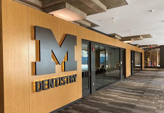
BIG BLUE’S TOOTH:The University of Michigan’s School of Dentistry updated its campus after more than six decades and the signage was a major component.
大大的蓝之牙:密歇根大学牙科学院在六十多年后更新了校园,标牌是其中的重要组成部分。
McCarthy and her team encountered an obstacle in the form of ongoing patient clinical services,which forced the team to conduct sign construction in multiple phases.The absence of windows throughout most of the building pathways and interior corridors posed another hurdle.Without a visual reference to outside landmarks and entrances,many people had difficulty figuring out where they were in the building and had to travel back to where they entered.
麦卡锡和她的团队遇到了一个障碍,那就是病人临床服务的持续性,这迫使团队分多个阶段进行标识施工。大楼的大部分通道和内部走廊都没有窗户,这也是另一个障碍。由于没有外部地标和入口的视觉参考,许多人很难确定自己在大楼里的位置,不得不回到进入大楼的地方。
As they began to design the signage,the iconic block“M”was prominently featured at three major entrances and locations.Directional panels at key intersections display large individual letters and panels,usually 40 in.wide x 90 in.high.Decreasing letter sizes also indicate the hierarchy of information,from more general orientation,e.g.clinics,research,Kresge Building,to more specific listing of spaces.
在开始设计标识牌时,标志性街区"M"被放在了三个主要入口和位置的显著位置。主要交叉路口的指示牌显示了大的单个字母和面板,通常为40英寸宽x 90英寸高。字母尺寸的减小也表明了信息的层次,从更一般的方向,如诊所、研究、克雷斯格大楼,到更具体的空间列表。
“We wanted to make walking through the building as easy and quick as possible,to enhance the patient and student experience,”McCarthy says.“A donor-recognition program was also developed that includes individual lettering,as well as names printed on acrylic bands at entries to clinics and on the many individual dental operatory stations.The donor names are all either the dark neutral or white,following the same color palette as all the wayfinding,but are applied on color bands that follow the architectural color coding by floor.”
"麦卡锡说:"我们希望尽可能方便快捷地穿过大楼,以提升病人和学生的体验。"我们还制定了一项捐赠者表彰计划,其中包括单个字母以及印在诊所入口处丙烯酸带和许多独立牙科手术台上的名字。捐赠者的名字都是深中性色或白色,与所有路标的色调相同,但都印在色带上,按照楼层进行建筑色彩编码。
Visual Entities,which produced all of the interior wayfinding,divided its work into five categories:code-required signs for restrooms,stairwells,exits and select building support rooms;room/space ID signs for labs,offices,support spaces,operatory/exam stations and workstations;clinic entrances,registration and elevators for highly-visible public access;wayfinding for directional information along pathways;and donor recognition to be displayed in a variety of locations.
Visual Entities公司负责制作所有的室内导向标识,其工作分为五类:卫生间、楼梯间、出口和特定建筑辅助房间的规范要求标识;实验室、办公室、辅助空间、手术室/检查站和工作站的房间/空间ID标识;诊所入口、登记处和电梯的高可视性公共通道标识;沿通道的方向信息标识;以及在不同位置展示的捐赠者识别标识。
Materials used included
所用材料包括
Cut-out acrylic lettering,routed and cut-out metal logos,fabricated and halo-lit metal logo.
6 mm ACM panels,routed to attach mounting z-clips for easy installation;background color painted with Matthews Acrylic Polyurethane,then graphics digitally printed with an Epson GS600 onto 3M 1J180 and Matte 8520 laminate applied to the painted panels.
Acrylic letters laser cut 3/8-in.deep,painted with Matthews Acrylic Polyurethane.
Tactile acrylic signs digitally printed with Direct Color Systems 2D Printer.
Colors all match standard Rowmark sheet plastics as used by the UM signshop.
切割丙烯酸字样、镂空和切割金属徽标、制作和光晕金属徽标。
6毫米ACM面板,镂空安装Z形夹,便于安装;底色涂有Matthews Acrylic Polyurethane,然后用Epson GS600在3M 1J180上数字打印图案,并在涂漆面板上使用8520亚光层压板。
激光切割3/8英寸深的丙烯酸字母,涂上Matthews丙烯酸聚氨酯。
用Direct Color Systems 2D打印机数字打印的触感丙烯酸标牌。
颜色均与UM招牌车间使用的标准Rowmark板材塑料相匹配。
The sign materials and fabrication processes were designed for the local UM signshop to make future adds/updates in-house through internal campus orders.
标牌材料和制作工艺是为当地的UM标牌店设计的,以便今后通过校园内部订单进行内部添加/更新。
As the$140 million project came to a close,university administrators were very pleased with the entire initiative including the wayfinding signage,stating that it was an important element of the restructured building.Even the students complimented the signage,saying that it is easier for them and for the patients to find their way to clinics,and the school seems more welcoming as a result.
随着耗资1.4亿美元的项目接近尾声,大学管理人员对包括导向标识在内的整个项目都非常满意,认为这是建筑重组的重要元素。就连学生们也对指示牌赞不绝口,说这样他们和病人就更容易找到去诊所的路了,学校也因此显得更加温馨。
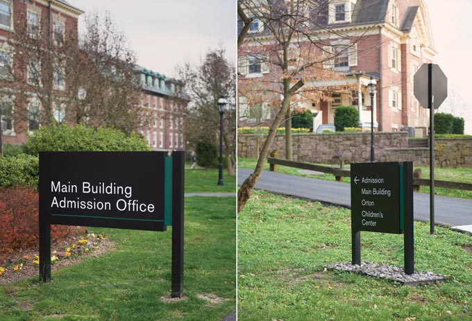
UNDER-STATED:The design is intended to harmonize with the architecture in a timeless manner.
构思欠佳:设计旨在以永恒的方式与建筑相协调。
TAKING THE CAMPUS TOUR
参观校园
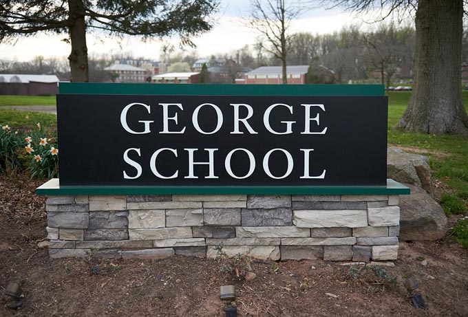
On the elegant campus of George School,a private Quaker co-ed boarding and day school outside of Philadelphia,administrators sought to increase its welcoming spirit for prospective students and their families with easy-to-identify wayfinding signage across the school’s 240-acre wooded campus.Last year,the school asked AGS,a signage and graphics manufacturing firm in Exton,PA,along with Keith Davis,a technical design consultant with KRD Design(Chester Springs,PA),to produce a turnkey design-build project for full campus exterior wayfinding.
乔治学校(George School)是费城郊外的一所贵格会私立男女寄宿和走读学校,在这所优雅的校园里,管理者希望在学校占地240英亩、林木葱郁的校园里设置易于识别的导向标识,以增强对未来学生及其家人的欢迎之情。去年,学校邀请位于宾夕法尼亚州埃克斯顿的标识和图形制造公司AGS与KRD Design(宾夕法尼亚州切斯特斯普林斯)的技术设计顾问Keith Davis一起,为整个校园的外部导向标识提供交钥匙设计建造项目。
“Our primary goal was to address an old,out-of-date campus signage system,but also support a new methodology of campus wayfinding and enhance the first-time visitor experience,”Davis says.“We designed and constructed new gateway entrance signage at the outset to establish the intended campus entry point,then crafted the campus wayfinding experience.”
"戴维斯说:"我们的主要目标是解决陈旧过时的校园标识系统问题,同时支持新的校园导览方法,增强游客的初次体验。"我们一开始就设计并建造了新的门户入口标识,以建立预定的校园入口点,然后精心设计了校园导览体验"。
The team met with campus administrators to review project goals,discuss the first-time visitor experience and general campus navigation challenges.It was important that the signage system harmonize with the campus architecture and enhance the school’s brand standards in an understated yet timeless way.The team then conducted a full-campus audit over three days to gather information and survey over 340 locations.
团队与校园管理人员会面,审查项目目标,讨论首次访客体验和一般校园导航挑战。标识系统必须与校园建筑相协调,并以低调而永恒的方式提升学校的品牌标准。随后,团队用三天时间对整个校园进行了审核,收集信息并调查了340多个地点。
“We looked at everything from GPS direction giving,vehicular circulation and walking paths,”Davis recalls.“We then went into a Wayfinding Master Plan,identifying the primary decision points around campus,parking lots and the destinations associated with those lots.We discussed naming,terminologies and methodology with the project stakeholders and took that data into design phase.”
"戴维斯回忆说:"我们查看了GPS方向指示、车辆通行和步行路径等所有方面。戴维斯回忆说,"然后,我们制定了一个寻路总体规划,确定了校园周围的主要决策点、停车场以及与这些停车场相关的目的地。我们与项目利益相关者讨论了命名、术语和方法,并将这些数据带入设计阶段。
Using this information,the team designed a full menu of custom sign types from vehicular wayfinding,lot and building IDs down to parking space signs and regulatory panels.A full-campus programming document was created based on the Wayfinding Master Plan and audit,which allowed AGS and KRD to work with the school’s facilities department on budgeting and project phasing for implementation.
利用这些信息,团队设计了一整套定制标识类型,从车辆导向标识、停车场和建筑标识到停车位标识和监管板。根据寻路总体规划和审计结果,AGS和KRD创建了一份完整的校园规划文件,以便与学校的设施部门共同制定预算和项目分期实施计划。
The sign’s design needed to be both utilitarian and aesthetic.For the project’s primary fonts,the team chose Akzidenz-Grotesk sans serif and Janson serif,both from the George School brand standard.To provide a natural integration into the environment,the team settled upon forest green,which harmonized with the campus and the outdoors.
标识的设计既要实用,又要美观。对于项目的主要字体,设计团队选择了乔治学校品牌标准中的Akzidenz-Grotesk无衬线字体和Janson衬线字体。为了与环境自然融合,团队选择了森林绿,与校园和室外环境相协调。
To ensure that the signage could withstand the elements,AGS used standard fabricated aluminum construction and Matthews applied paint in a post-and-panel style with reflective 3M vinyl.AGS also used Wayfindit to perform the programming services for client review and approvals,as well as organize the manufacturing phases to ensure that the copy/message on each sign was confirmed prior to application.Sign face layouts were created for every location,allowing the school prior approval while two sign location prototypes were used to evaluate size,scale and legibility.
为确保标识牌能够经受风雨侵蚀,AGS采用了标准的铝制结构和马修斯涂漆工艺,并使用了反光的3M乙烯。AGS还使用Wayfindit为客户审查和批准提供编程服务,并组织制造阶段,以确保在应用前确认每个标识上的文案/信息。为每个位置都设计了标志面布局,以便学校事先批准,同时使用两个标志位置原型来评估大小、规模和可读性。
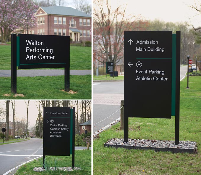
EASY DOES IT:Designing simple fabrication methods helped keep this project on budget while meeting expectations.
简便易行:设计简单的制作方法有助于将该项目预算控制在预期范围内。
Dimensional lettering for the main ID’s is router-cut then mounted to the sign cabinet using very high bonding(VHB)tapes,designed for applications where a permanent bond is needed and expected.
主要标识的尺寸字样由刳刨机切割而成,然后使用超高粘合(VHB)胶带安装到标识柜上,这种胶带专为需要永久粘合的应用而设计。
As the new signage was being installed,the AGS team worked with the school’s facilities department to discuss specific sign placement.This included winter snow removal methods that had affected previous sign locations and appropriate setbacks to maintain visibility.
在安装新标识的过程中,AGS团队与学校的设施部门一起讨论了标识的具体位置。这包括影响以前标识位置的冬季除雪方法,以及保持可见度的适当后退。
Landscaping can also be a wrinkle around campus wayfinding,so the team worked with the facilities crew on landscape edging and river rock infill around the wayfinding signage to protect the base of the sign locations from damage and extend system longevity.
景观美化也可能成为校园导向标识周围的一个障碍,因此团队与设施工作人员合作,在导向标识周围进行景观镶边和河石填充,以保护标识位置的基座不受损坏,并延长系统的使用寿命。
With the project fully wrapped,George School was extremely pleased.“With transparency from the beginning,we established budgets to be fiscally responsible to the school’s overall signage budget while designing simplistic fabrication methods and meeting its design exceptions,”Davis says.Today when George School holds an open house or graduation,students,prospects and their families can easily navigate the school’s leafy campus.
项目全部完工后,乔治学校非常满意。"戴维斯说:"从一开始,我们就以透明的方式制定预算,对学校的整体标识预算负责,同时设计简单的制作方法,满足其设计上的特殊要求。如今,每当乔治学校举办开放日或毕业典礼时,学生、潜在学生及其家人都能轻松地穿梭于学校绿树成荫的校园中。


