The New Victory Theatre, located on New York’s 42nd Street, is described as the city’s first and only not for profit performing arts venue for kids and families. It has a programme that covers a multitude of artistic disciplines and draws on traditions from a variety of cultures. Alongside performances and family workshops the theatre also seeks to offer performing arts education and engagement, new work development and furthers paid youth employment and training.
新胜利剧院位于纽约市第42街区,是该市首个不以盈利为目的的亲子表演艺术场馆,场馆内部提供的活动与课程涵盖了众多艺术学科,包含各种传统文化,除了表演和亲子作坊,剧院还提供签约制的艺术表演课程,让参与者可以进行有偿表演和培训,获得工作发展的机会。
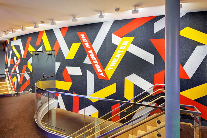
Pentagram partner Paula Scher and team worked to develop a visual identity for the theatre and collaborated with architecture firm H3 to conceive and implement a lobby space that would better engage with theatre visitors. A ribbon motif becomes the foundation of a bright and celebratory visual language. This is expanded upon spatially and materially across signage and a 51-foot-long centrepiece mural made of felt.
Pentagram公司的合伙人宝拉·谢尔及其团队接下了新胜利剧院的设计工作,他们与H3建筑公司合作,开发出一整套视觉特效布置在剧院大厅中,大大提高了与游客的互动性,并且使用丝带团作为“明亮、喜庆”的视觉语言基础,通过导视标识和16米(51英尺)长的毛毡中心壁画,将材料与空间的扩展做到了极致。
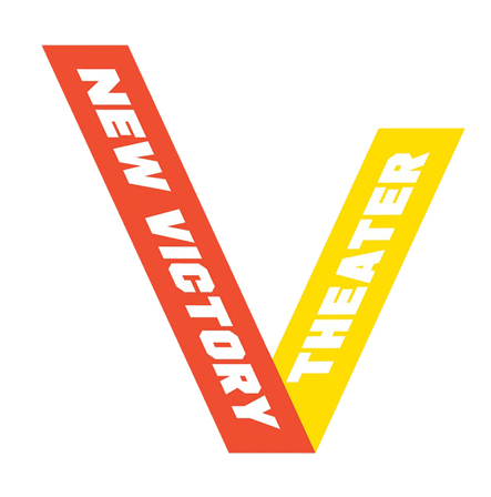
The foundation of the New Victory Theatre visual identity employs a simple ribbon motif. This is folded into a V to create a logo and hold the name, and is then built out into a confetti-like graphic pattern and signagesystem that occupies three-dimensional space. The visual language is clearly one of celebration that folds in neatly with the name of the theatre, performance and achievement. It is not unusual, but serves the child and family-centric audience well, and derives its distinction from the creativity of its application throughout the theatre space.
新胜利剧院全部视觉特效的基础只采用了一个简单的缎带图案,将其折叠成V型标识并镂上剧院名称,在长达16米的毛毡壁画上,将一条条V型标识像纸屑一样组合起来,并制作出立体特效,这样的视觉语言并不罕见,但却与这座剧院,剧院里的表演,以及剧院的名称巧妙地融合在一起,像是在庆贺胜利一样,这样的场景很好地服务于以亲子群体为主要受众的游客,并且让整个剧院体现出一种在空间的应用与创造力上的与众不同。
The logo manages to resolve a couple of ideas; the form language of the ribbon and an allusion to the spatial nature of the theatre experience, and employs the appeal of colour and impact of bold typography.
这幅V型标识有两个颇具灵感的设计:缎带造型的设计语言暗示了这所场馆的表演性质;大胆运用色彩以及粗犷的排版,展示出剧院的影响力。
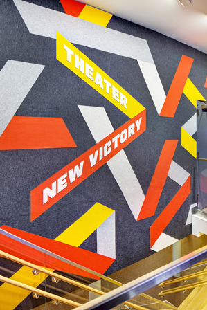
The mural, which spans 51 feet and made of felt, neatly finds a balance between a striking visual expression, the tactile language of soft play spaces and the hands-on nature of the theatre’s educational programming. It is eye-catching and immediate in its use of form, colour contrast, scale and tactility, compelling and appealing for children and sophisticated enough for adults. This is supported by its use of colour; bright yellow and red alongside grey.
用毛毡制成横跨16米的壁画,巧妙地在引人注目的视觉表达、柔软的游戏空间触觉语言、剧院教育节目的动手操作这些特点之间找到了平衡,它将形式、色彩对比、比例和触感的运用得不仅可以直接吸引儿童,连足够成熟的成年人也会被惊艳到,而这面壁画仅仅只用了亮黄色和红色以及灰色。
The impression is grand, creating a strong link between the space, the experiences it offers and the graphic language. Outside of the space; in printed communication and online, it is likely to serve as a simple device to connect information and brand imagery, although without the scale, tactility and creativity of signage, looses some of its distinction. This is certainly a visual identity that is first and foremost about creating a memorable lobby space and communicating some of the theatre’s hands-on philosophy.
剧院的整体观感颇为宏大,它在空间、体验和图形语言之间创造了一种强烈的联系,而壁画作为一个传播与沟通的简单视觉识别设施,虽然不是铺满了整个剧场,但利用触觉和创造性的标识连接想要传达的实践哲学和品牌形象,创建了一个令人难忘的大厅。
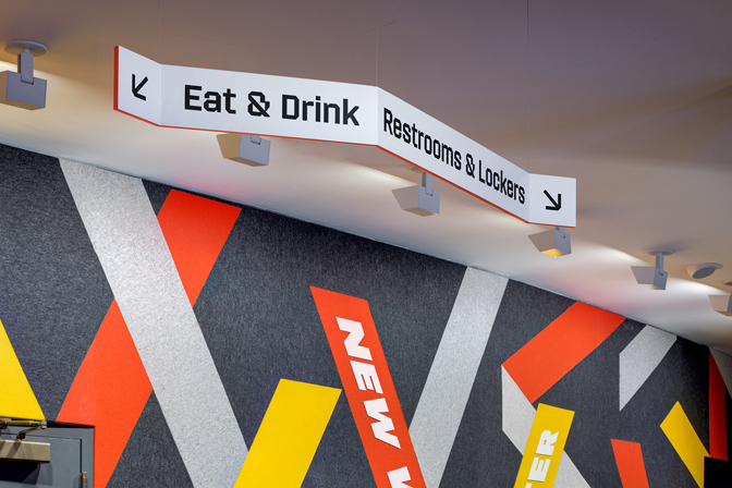
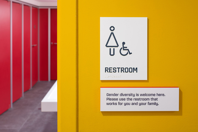
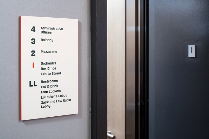
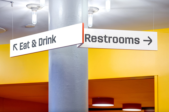
The graphic language of ribbons moves into three-dimensional space in the form of wayfinding. Where the ribbon may be a familiar and transferable graphic device, the signage manages to draw something new from this, finding a synergy between a distinctive graphic appeal tied to an overarching concept of achievement and enhanced functionality (the folds of the ribbon neatly tie in with the directional purpose). This is a highlight. Raising signage off flat surfaces, and enhancing this dimensionality by way of red edging; a ribbon of colour around the surfaces develops the concept further.
缎带式的图形语言一直为人熟知,但剧院设计者希望能从其中开发出新的创意,于是它以导视标识的形式进入剧院中。缎带的折叠感恰好与导向性的目的相联系,在图形吸引力与功能性之间找到了协同作用,同时将标识的高度拔高远离地面,使用红色镶边增强唯独干,这些导视标识成为了剧院中的亮点之一。
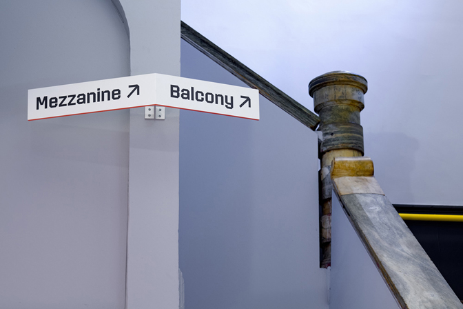
There is tension in the choice of type. Not custom but clearly selected for its diagonal cuts, this shares something in common with the folds of the ribbon motif, seeking to develop continuity, however, in weight and letterforms leans more towards the technical and mechanical. Iconography uses a similar approach to derive distinction from common pictograms.
缎带式的导视标识明显采用了对角线切割,极好地表现出它的张力,这与平面的缎带图案有共通之处,即利用褶皱寻求发展连续性,而立体标识的重量和字体更倾向于工业设计,在图形学上通常会用类似的方法将其与普通象形图做出区分。
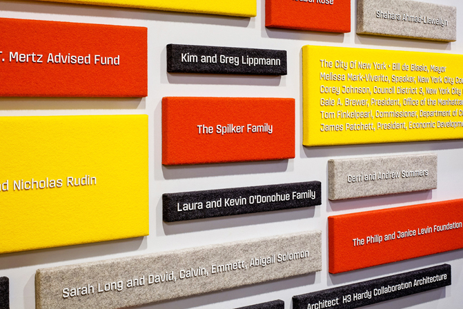
The donations board, a familiar feature of cultural institutions, is reimagined as a wall of colourful and tactile felt panels. These are materially and visually appealing. Again, there is a dissonance between play and the technicality of type, however, raising this adds to the material experience and over continuity of concept.
捐赠委员会名单在显眼的地方被列出是文化机构内部的一个常见特征,在这座剧院里,名单被单独设计成一面墙体,由色彩鲜艳、触感强烈的毛毡板组成,无论是材料还是视觉效果都很吸引人。
需要知道的是,无论如何,表演与游戏和工业技术之间都会存在不协调的一面,只能以丰富的设计制造经验,以及努力增加设计概念的连续性来弥补这一问题。
