In-store signage gets bolder and more interactive.
如何让你的招牌会说话,让店招标识变得更大胆,更具互动性
Signage has long been a “silent sales-person” in retail spaces, assisting with wayfinding, sales promotions and product information. But as today’s stores are in a life-and-death battle with online retailers, signs are being called on to do even more in brick-and-mortar settings. Specifically, traditional print signs are becoming more colorful and information-rich, and digital displays are adding high-resolution video and interactivity to the equation.
标牌长期以来一直是零售场所的“沉默销售人员”,协助寻找路线、促销和产品信息。但由于如今的商店正与网络零售商展开生死攸关的较量,各种迹象正被要求在实体环境中做更多的改变。具体来说,传统的印刷标识越来越丰富多彩,信息也越来越丰富,数字显示器也在增加高分辨率视频和互动性。
HARVESTING LOCAL TIES
收获当地联系
The grocery industry has always been notoriously competitive and saddled with excruciatingly narrow margins. Add to that a recent influx of both big-box competitors (such as Target and Walmart) and online rivals such as Amazon Prime Pantry, Blue Apron and Peapod into the field, and it adds up to longevity being no guarantee of ongoing success for traditional grocery stores.
食品杂货业向来以竞争激烈著称,利润率极低。再加上行业大鳄竞争对手(如Target和沃尔玛)和在线竞争对手(如Amazon Prime Pantry、Blue Caper和Peapod)纷纷涌入这一领域,这就意味着市场份额巨大并不能保证传统杂货店的持续成功。
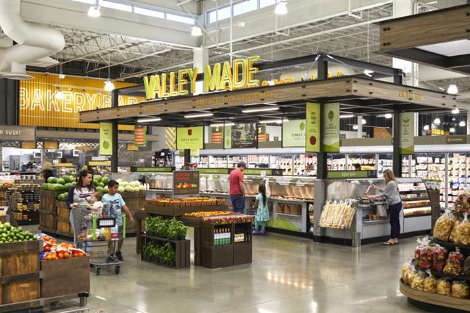
Against that backdrop, the Save Mart (Modesto, CA) chain of supermarkets – which has been in business since 1952 and operates stores under the Save Mart, Lucky California, FoodMaxx and MaxxValue Foods banners/brands – brought in retail design firm Shook Kelley (Charlotte, NC) to redevelop its flagship brand and make it more relevant to today’s consumers. Signage, in turn, plays a central role in that new ID, which is on display at its new prototype store in Modesto.
在这种背景下,自1952年开始营业的Save-Mart(加利福尼亚州莫德斯托)连锁超市(Save-Mart,Lucky California,FoodMaxx和MaxxValue Foods旗下的商店/品牌)携手零售设计公司夏洛特(NC) 重新开发旗舰品牌,使之更贴近当今消费者,标识在发挥一个中心的作用,一个新的身份象征,下图是其在莫德斯托的新原型商店展示。
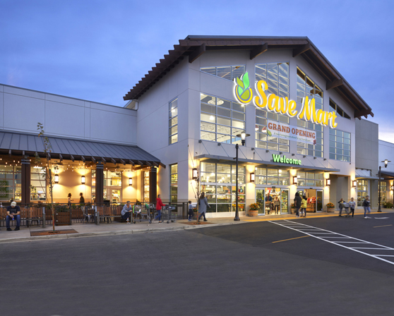
Save Mart recruited retail design firm Shook Kelley (Charlotte, NC) to revamp its brand.
Save-Mart招募了零售设计公司shake Kelley(北卡罗来纳州夏洛特市)对其品牌进行改造。
After taking a deep dive into the Save Mart brand, Shook Kelley’s team focused on building more meaningful connections between the store’s flag and its origins in the Central Valley of California, one of the world’s most productive agricultural regions. Shook Kelley designed all the environmental graphics in the store and had D|Fab (Madison Heights, MI) fabricate that package. “Save Mart has been working with local producers, suppliers and farms for many decades,” said Shook Kelley designer Sabrina Fan. “But outside of its produce displays, the brand was not necessarily building on those relationships as a primary point of differentiation, uniqueness and/or storytelling.”
在深入了解了Save-Mart品牌之后,shake Kelley的团队致力于在Save-Mart的旗帜和它发源于世界上最具生产力的农业地区之一的加利福尼亚中央山谷之间建立更有意义的联系。Shake Kelley设计了店里所有的环境图形,并让D | Fab(密歇根州麦迪逊高地)制作了这个标识项目,几十年来,Save-Mart一直与当地的生产商、供应商和农场合作,shake Kelley设计师Sabrina Fan说:“在产品展示之外,品牌并不一定是建立在这些关系的基础上,以此作为差异化、独特性和/或讲述品牌故事才是要点。”
To better reflect its strong agricultural roots, the designers began by creating a new logo mark that’s an abstraction of the region’s geography. The new Save Mart logo, with leaves sprouting from the center, signifies the region’s role as a cornucopia of freshness and land of abundance, designers said.
为了更好地反映其强大的农业根源,设计师们首先创造了一个新的标识,抽象但富有内涵的表现了这一地区的特征,设计师们说,新的Save-Mart标识从中间长出了叶子,象征着这个地区可以提供新鲜的食材,以及是个富饶之地。
In addition, to reference local produce stands offering fresh products straight from the source, the designers incorporated a look that’s inspired by hand-painted signage into the logo. “Taken together, the logo now stands for Save Mart’s extraordinary focus on fresh produce, going beyond standard offerings, thanks to the brand’s strong roots and the Central Valley’s agricultural wealth,” Fan said.
此外,为了参考商城中的各种产品摊位,直接从源头上提供新鲜产品,设计师们将手绘标牌的灵感融入到了标识中。范说:“综合起来,这个标识现在代表了Save-Mart对新鲜农产品的非凡关注,并且超越了所以周边鲜超的产品标准,这要归功于该品牌的强大根基和旗下的农业财富资源。”
As for the store itself, the Produce Depot tells a story of local agriculture, fresh from Central Valley, by taking such steps as installing corrugated metal to allude to warehouses and the transportation of produce. Signage plays a large role in communicating that message in this part of the store, in the form of a large plant wall made of pallets and large “Local” graphics painted directly on concrete blocks.
至于商店本身,农产品仓库通过安装波纹金属以暗指仓库和农产品运输等步骤,讲述了一个来自中央山谷的当地农业故事,在商店的这一部分,标牌在传达这一信息方面发挥着重要作用,其形式是由托盘和直接在混凝土块上绘制的大型“本地”图形组成的大型工厂墙。
Other visual elements in the store include wall photographs of real Central Valley producers, farmers, craftsmen and workers, creating an atmosphere of authentic local community and industry. At the same time, exposed framing and visible concrete blocks throughout the store communicate messages of value and “direct from the source” stories in ways specific to the area.
店内的其他视觉元素包括真实的中央山谷生产者、农民、工匠和工人的墙壁照片,营造出真实的当地社区和工业氛围。同时,整个商店的外露框架和可见混凝土块以特定的方式传达有价值的信息和“直达商品源头”的故事。
LARGE-SCALE STORYTELLING
传播品牌故事
Long-established brands like Save Mart are using signage to strengthen their market muscle, and the same holds true for such companies as South Korean cosmetics retailer Innisfree (Seoul), which is seeking to make major inroads into America. In doing so, the retailer is going up against entrenched competitors Maybelline, L’Oréal, Coty and Estée Lauder. Undeterred by those big names, Innisfree is using in-store digital experiences to lure customers through the door.
像Save-Mart这样久负盛名的品牌正在利用标牌来增强其市场实力,韩国化妆品零售商Innisfree(首尔)等公司也是如此,该公司正在寻求进军美国市场。在这样做的同时,这家零售商正在与根深蒂固的竞争对手美宝莲、欧莱雅、科蒂和雅诗兰黛展开竞争。Innisfree没有被这些大牌吓倒,而是利用店内数字体验吸引顾客进门。
The retailer first teamed with Louisville, KY-based Creative Realities Inc. (CRI) in late 2018 to update its stores by installing large-scale LED screens showing product-related video at its store on Lexington Avenue in New York City. Based on the positive reception that new look received, the two firms inked a deal to install similar updates at multiple US stores slated for openings through the second quarter of this year. “The Innisfree Lexington store in New York City achieved the impossible, drawing attention away from long-established competitors that are located just steps away – competitors with loyal customer bases,” said Beth Warren, CRI’s senior vice president of experience planning and design. “By using large, bright LED displays to draw in customers and create a center of gravity for storytelling, shoppers are experiencing the brand’s natural-ingredient theme in a way that encourages excitement and sharing on social media.”
这家零售商于2018年底首次与总部位于肯塔基州路易斯维尔的创意现实公司(CRI)合作,通过在位于纽约市列克星敦大道(Lexington Avenue)的门店安装显示产品相关视频的大型LED屏幕来更新门店,基于new look受到的积极欢迎,两家公司签署了一项协议,在定于今年第二季度开业的多家美国商店安装类似的更新。CRI体验规划与设计高级副总裁贝丝•沃伦(Beth Warren)表示:“位于纽约市的莱克星顿英尼斯弗里酒店实现了不可能的目标,将注意力从距离我们仅几步之遥的老牌竞争对手——拥有忠诚客户群的竞争对手身上转移开,通过使用大型、明亮的LED显示屏吸引顾客,并为讲故事创造一个重心,购物者正在体验品牌的天然成分主题,以鼓励他们把体验分享在社交媒体上。”
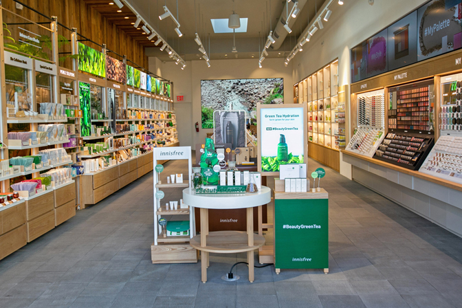
Photo courtesy of NanoLumens.
照片由纳米流明提供
The displays that CRI specified for the work are from NanoLumens, with Warren describing its products as “an ideal fit for the Innisfree retail stores because its LED displays are absolutely not a one-size-fits-all solution. Each store has slightly different space availability, and with these [displays], we are able to specify exact sizes and pixel-pitches unique to each store to achieve a consistent aspect ratio and pixel count that vastly simplifies content creation and display.” She added that flexibility means the displays blend with their environment, and don’t appear to be a bolt-on afterthought, a crucial element in consumer-facing environments.
CRI为这项工作指定的显示器来自纳米流明,沃伦称其产品“非常适合Innisfree零售店,因为其LED显示器绝对不是一刀切的解决方案,每个商店的可用空间略有不同,有了这些[显示器],我们可以指定每个商店特有的精确大小和像素间距,以实现一致的纵横比和像素数,从而大大简化内容的创建和显示,灵活性意味着显示器与环境融为一体,在面向消费者的环境中,这是一个需要提前就预设好的关键方案。
The large-scale displays are used to create an inviting environment by depicting natural scenes and landscapes that evoke a calming effect and relate to the brand’s ingredient sourcing on the remote South Korean island of Jeju. Large windows at the storefront make the signs visible to passersby, which entice them into the space.
这些大型展示是用来创造一个诱人的环境,通过描绘自然场景和景观,唤起一种平静的效果,并与该品牌在偏远的韩国济州岛的原料来源有关,店面上的大窗户使路人能看见这些标识,从而吸引他们进入商店。
Beyond such screens, the cosmetics brand has integrated other high-tech features, such as touchscreen stations that instantly analyze a shopper’s skin tone to recommend products for their specific needs, and smaller digital displays that promote products and identify different areas of the retail space.
除了这些屏幕之外,该化妆品品牌还集成了其他高科技功能,例如可以即时分析购物者肤色以推荐符合其特定需求的产品的触摸屏,以及可以推广产品和识别零售空间不同区域的小型数码显示屏。
PIERCING INSIGHTS
敏锐的洞察力
Claire’s (Hoffman Estates, IL), is a fashion-accessories specialty retailer catering mainly to tweens and teen girls. But what it’s probably best-known for is ear-piercing – the international chain estimates more than 100 million such procedures have been performed in its stores over the years.
克莱尔(Hoffman Estates,IL)是一家时尚配饰专业零售商,主要面向青少年女孩,但它最出名的可能是打耳洞——据这家国际连锁店估计,多年来,它的门店已经完成了超过1亿次这样的手术。
Playing up that aspect of the business took center stage in the latest prototype store layout by BHDP Architecture (Cincinnati) . That firm, in turn, brought in Triangle Sign Services (Baltimore, MD) , and products from SparkleMasters, Perspectives in Print and Testrite Visual Products for various aspects of the signage, which played a major role in the update. BHDP noted that the retailer had been moving the store’s ear-piercing station from the back to the front, just to the side of the main entrance and behind the store’s floor-to-ceiling front windows.
在BHDP建筑公司(辛辛那提)最新的原型商店布局中,这方面的业务占据了中心位置,该公司又引进了三角标牌服务(马里兰州巴尔的摩)和SparkleMasters的产品、单透海报图和Testrite标牌各个方面的视觉产品,这些产品在更新过程中发挥了重要作用,必和必拓指出,这家零售商一直在将该店的耳洞站从后面移到前面,就在正门的侧面,以及商店的落地窗后面。
“What we did for the prototype was celebrate and elevate the ear-piercing experience at the front of the store,” said BHDP retail leader Andrew McQuilkin. That included installing faux neon signage by Triangle bearing the words “ear piercing” on the inside of the window, putting the process on prominent display to pedestrians (which are typically mall patrons, as most Claire’s are in such shopping complexes).
必和必拓零售业务负责人安德鲁•麦克奎尔金(Andrew McQuilkin)表示:“我们为原型店所做的就是庆祝并提升店面的穿耳体验,这包括在窗户内侧安装带有“刺耳”字样的三角形人造霓虹灯标牌,向行人(通常是购物中心的顾客,因为大多数克莱尔都在这样的购物中心)展示这一过程。
“Neon is very on trend right now, and Claire’s wants to be at the forefront of trends and fashion,” McQuilkin said. Reinforcing the availability of its popular piercing service is vertical lettering sign by Triangle reading “ear piercing” on the side wall opposite the piercing station.
麦克奎尔金说:“霓虹灯现在非常流行,克莱尔希望走在潮流和时尚的前沿,加强其流行的穿孔服务,在穿孔站对面的侧壁上用三角形标记“耳朵穿孔”的垂直字体。”
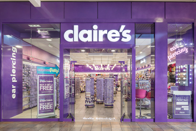
BHDP Architecture (Cincinnati) combined with Triangle Sign Services (Baltimore, MD) on this project for Claire’s.
BHDP建筑(辛辛那提)与三角标识服务(巴尔的摩,马里兰州)联合为克莱尔的这个项目。
Beyond those changes, the designers sought to visually unite the store’s interior walls by installing a horizontal band of metallic wallcovering at their tops bearing the brand’s signature purple. On the side walls, that band is covered with graffiti-like messages that were created by BHDP graphic artists and screenprinted on silver-metallic wallcovering by Perspectives in Print. “These are meant to look like handwritten messages, things you would write in a note to a BFF,” said BHDP senior graphic designer Heather Steiner.
除了这些变化之外,设计师们还试图通过在商店的顶部安装一个带有品牌标识性紫色的水平金属墙纸带,在视觉上统一商店的内墙,在侧墙上,这个乐队被BHDP图形艺术家创作的涂鸦般的信息所覆盖,并被印刷的透视图印在银色金属墙纸上。必和必拓高级平面设计师希瑟·施泰纳(Heather Steiner)说:“这些信息看起来就像是手写的信息,是你在给一个朋友的便条上写的东西。”
Anchoring the back wall is a non-illuminated channel letter sign bearing the retailer’s name created by Triangle. That sign, in turn, is embedded in a set of interlocking sequin panels that was fabricated by SparkleMasters that makes the surface appear to shimmer. “The ‘shimmer wall’ helped achieve the client’s goal of bringing more sparkle and overall visual excitement to the space,” McQuilkin said.
商店的背景墙LOGO是一个非照明的通道字母标识,上面有三角形创建的零售商名称,这个标识反过来是嵌入在一组亮片面板上,呈现出闪闪发光的动态效果,使表面不停的闪烁。麦克奎尔金说:“微光墙”有助于实现客户的目标,为空间带来更多的闪光和整体视觉刺激。”
Triangle also made signs reading “be-you-tiful” for one side wall and “dream big” on the other, along with the illuminated “claire’s” sign on the store’s front façade. Beyond that, designers added one other signage system to the space: a rail running along the side walls with hanging category signs (“hot new trends,” “hair flowers,” “style your space,” etc.) from Testrite.
三角形还为一面墙和另一面墙制作了“你的梦想是伟大的吗”标识,并在商店的正面加上了照明的“claire's”标识。除此之外,设计师还为这个空间添加了另一个标识系统:沿着侧墙的栏杆,上面悬挂着Testrite的分类标识(“热门新潮流”、“发花”、“打造您的空间风格”等)。
“The product offerings can get very busy, so having those signs made the overall space a little cleaner and easier to navigate,” BHDP’s Steiner said.
必和必拓的施泰纳说:“产品供应可能会变得非常繁忙,因此有了这些标识,整个空间就更干净了,也更容易导购。”
Finally, BHDP used signage to enhance the store’s entry/exit experience. Upon entering, customers are greeted with a “hello beautiful” message projected via a spotlight on the floor. “It’s more cost-effective than embedding something there, and it also allows them to change or update the messaging as needed,” McQuilkin said. And on their way out, customers see a sign by Triangle embedded in a cross member above the door that says, “we make memories.”
最后,必和必拓利用标牌提升门店的出入境体验,进入时,顾客会收到一条“你好漂亮”的信息,该信息通过地板上的聚光灯投射出来。McQuilkin说:“它比在那里嵌入一些东西更具价值效益,而且还允许他们根据需要更改或更新消息。”而在出门的路上,顾客看到门上方的横梁上镶嵌着一个三角形的标识,上面写着“我们制造美好记忆”
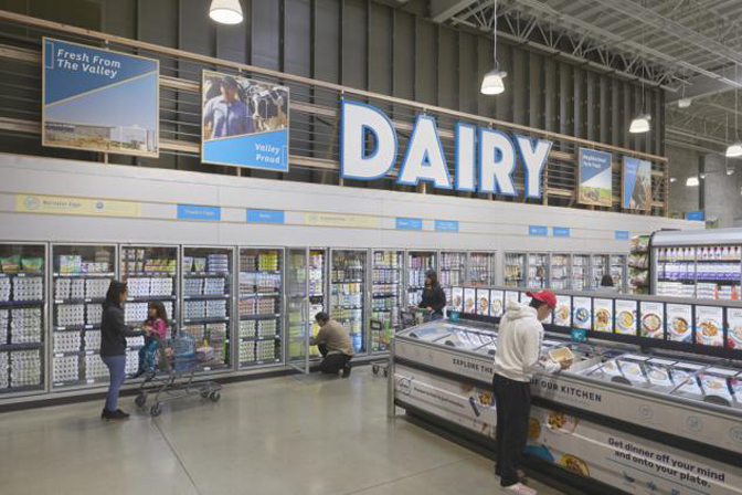
Photo by 2020 lawrence anderson.
2020年劳伦斯·安德森摄
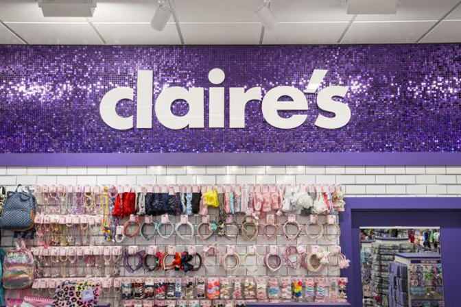
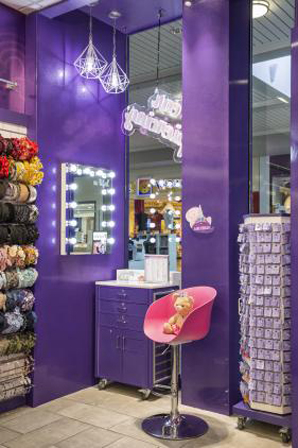
Photo courtesy of mark steele.
照片由马克·斯蒂尔提供


