A trio of sign installations shows that classic lighting still has the power to mesmerize passersby.
三款不同风格的霓虹灯表明,潮流的跟随,经典的延续,不老的霓虹灯标识。
Although last month’s State of the Industry survey showed that neon is the illumination source of choice for only 9% of electric signs, many remaining neon shops now enjoy all the work they can handle. While LED lighting’s dominance is undeniable – the technology is now available in forms that very closely mimic neon and is the source of choice of 85% of illuminated signs – it’s also stubbornly clear that neon is more than just hanging on. It’s become a specialty item that remains in demand, albeit at a lower level than it used to be. And whether a neon sign is intended to reflect the classic appeal of a movie theater marquee, a shop’s creativity or a retro look for a renovated office building, neon signs continue to dazzle and delight.
根据上个月的行业状况调查显示,传统的霓虹灯在发光标牌的照明光源占比为9%,但许多剩余的霓虹灯供应商依然在这个领域能承接到相应的业务。虽然LED光源已成为未来发光标识的首选,但是目前市场中出现的这种非常接近霓虹灯的光源,已拥有85%霓虹灯标识的市场。很明显,霓虹灯标识不仅仅是停留在过去,现已成为一种仍有需求的产品,尽管它的制作要求要比以前容易的多,霓虹灯标识还是以它独有的特色和风格,为电影院门厅的经典魅力传承,还是商店的创意,抑或是翻新办公楼的复古外观,霓虹灯标识都继续让人眼花缭乱、欣喜若狂。
HELPING THE SHOW GO ON
霓虹灯标识唤醒往日经典
What needs to be more attention-grabbing these days than a theater marquee? In this era of streaming video and other high-tech viewing alternatives, such businesses need signs with a “wow factor” to help bring patrons through the turnstiles.
现在还有哪个大剧场更吸引你的?在这个流媒体视频和高科技观看替代的时代,这种大剧场的形式需要带有“惊喜因素”的标识,才能推动客户愿意进入大剧场的旋转栅门。
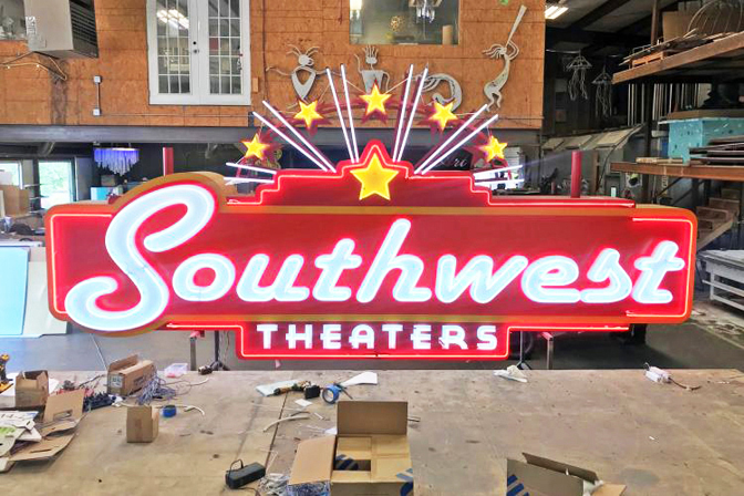
For Southwest Theaters’ multiplex in Austin, TX, local company Ion Art was commissioned to create a freestanding sign that would serve as a beacon to the site. That sign, in turn, is an embellished, 3-D version of a stylized wall sign Ion Art had previously created for the client.
在德克萨斯州奥斯汀市的西南影院,离子艺术标识公司受委托制为他们定制了一个独立的标识,可以作为这个地方的地标。正面呈现的是一个三维版本的风格化墙壁标识,反过来,是一个装饰墙。
“Getting this commission was something of a no-brainer, as we had already done the wall signs for Southwest,” said Ion Art designer Jason Ice. “Like those placards, we wanted the freestanding one to have a retro-inspired feel, which made neon the natural choice for it.”
Ion艺术设计师杰森·伊斯说:“获得这个定单是一件不费吹灰之力的事,因为我们已经为西南地区做了墙体标识,和那些标语牌一样,我们希望独立式的标识牌有复古的感觉,这让霓虹灯标识自然成为他们的不二之选。”
The sign’s neon elements include its lettering and star “crown,” along with straight vertical tube lines adorning each of its two support pylons, and horizontal ones encircling the globes atop each post. The latter two pieces were the major additions to the 2-D version of the sign.
该标识的霓虹灯元素包括其字母和星形“皇冠”,以及装饰其两个支柱上的直线垂直管道线,以及围绕每个支柱上的球体的水平管道线。后两件作品是该标识的二维版本。
To design and fabricate the sign, Ion Art used CorelDRAW, SAi Flexi and ArtCAM software. They fired up their AXYZ CNC router and 2000W CNC fiber laser to shape ⅛-in. aluminum (for the face and backer of cabinet), ¼-in. aluminum (support plates), .063-in. aluminum (returns of cabinet and reverse channel letters), .090-in. aluminum (faces of reverse channel letters) and .155-in. Lexan (backers of reverse channel letters). The sign also features 18-in. Lexan globes. Ion Art put its Matthews paint-matching system and spray booth to work, as well as its Graphtec vinyl plotter for the paint masks. The lighting comprises clear gold and red neon, 6500K Neon Everylite Red and 6500K LED modules for halo lighting. The company installed the freestanding marquee using a 65-ft. Elliott crane truck.
关于这个标识的设计和制作,离子艺术标识公司采用CalelDRAW,SAI FRILI和ARTCAM等软件。他们运用的设备有:AXYZ数控雕刻机和2000瓦数控光纤激光切割机,使其成形。铝材有:1/4英寸(用于标识橱柜的正面和背面),0.063英寸(支撑板),0.090英寸(标识箱体和反向发光字母),155英寸(反向发光字母的面)和聚碳酸脂(反向发光字母材料),采用马修斯油漆进行喷漆,运用格拉夫泰克乙烯基绘图仪进行油漆面的修整。照明光源采用:透明金色和红色霓虹灯、6500K霓虹灯珠光体红色和6500K LED光环照明模组。这个标识总共有18英寸,最后该公司使用65英尺埃利奥特起重机进行了标识的安装。
Ice added that one potential headache related to the project was the sign’s placement atop an existing set of pylons. “I was worried that configuration could lead to hiccups in the fabrication or installation process,” he said, but happily, such worries were avoided.
ICE补充说:“比较头痛的问题就是现有的一组塔顶上的标识放置问题,担心配置会导致制造或安装过程中出现故障,万幸的是,这样的担心最后被避免了。”
CREATING A CALLING CARD
室内霓虹灯标识
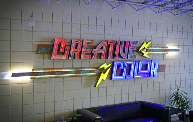
Creative Color (Minneapolis) fashioned this striking sign with open-faced neon channel letters for itself.
创意色彩(明尼阿波利斯)用开放式霓虹灯发光字母为自己打造了这一引人注目的标识。
You may have heard the saying, “The shoemaker’s children go barefoot.” A similar principle applied to Creative Color’s (Minneapolis) efforts to fashion a new lobby sign for itself. “When we first moved into our new building in February 2017, we never thought it would take the better part of two years to create this sign, but we kept putting off working on it to do our clients’ projects first,” said Brent Luther, the company’s owner/creative director.
你可能听过这样一句话:“鞋匠的孩子们赤脚走。”一个类似的原则适用于创意色彩公司(明尼阿波利斯)为自己打造一个新的大堂标识。该公司的所有者/创意总监布伦特•路德(Brent Luther)说:“2017年2月,当我们第一次搬进新大楼时,我们从未想过要花两年多的时间来打造这一标识。”
But that’s only one reason this creation had such a long gestation period. Another major factor was the company’s desire that the sign be a real statement-maker. “We wanted this piece to act as inspiration for any current or prospective clients touring our facilities,” Luther said. To that end, the company created a sign that includes a variety of media to create visual interest. “Wood, metal, neon, lead, rust – this sign has it all,” he said.
也许这就是造物孕育期如此之长的一个原因吧!卢瑟说:“我们希望这件作品能为任何正在参观我们场所的顾客或者是潜在顾客传达信息,为此,该公司制作的不仅仅是标识,还包括各种媒介,以达到视觉传播的作用。他说:“木头、金属、霓虹灯、铅、铁锈——这个标识牌无所不包。”
One of the biggest challenges the company faced in designing the sign was securing the right look for the metal backing the neon letters. “We went through a bunch of designs using Adobe Creative Suite before we settled on this style,” Luther explained. “The channel letters on the wall felt too blank, so bringing in the patina metal, wood and bolt hardware (and even illuminating the smaller slats) really brought in a depth to the sign and filled up the space neatly.”
这家公司在设计这一标识时面临的最大挑战之一,是如何找到支持霓虹灯字母的金属底板。卢瑟解释说:“我们在确定这一风格之前,使用Adobe Creative Suite进行了一系列设计。墙上的槽字显得太苍白单一了,我们采用了很多种材料来你补不足,譬如:绿铜金属、木头和螺栓五金件、线形灯带,这样不仅给标识带来了深度,并且把空间整齐地填满了。
Fabricating the sign involved open-faced neon channel letters with 3-in. (.040) aluminum returns and .063-in. aluminum back panels. Illuminated with custom neon (electric blue, magenta) by way of 120 V AC NeonPro transformers, the shop sign also features backer slats, 1- to 3-in.-deep pine slats, ¼-in. white acrylic, .063-in. aluminum custom patina-painted faces and copper-bolt hardware. Additional illumination is provided by Principal LED Qwik Mod 2 120 V modules and 277 V remote LED power supplies. After all the components were assembled, the sign was installed using drills and wall anchors.
所用的材料和光源包含有:0.40英寸和0.63英寸铝制背板,120 V AC NeonPro标识电源,定制霓虹灯光源(宝石蓝色,洋红),商店标识还配有1至3英寸深的松木板条,0.063英寸白色亚克力,铝合金定制绿铜漆面和铜螺栓五金件,额外照明由主要的LED Qwik Mod 2 V模组和277 V远程LED电源支持。总计3英寸霓虹灯发光字母标识,所有部件组装好后,用钻头和墙锚安装标识。
Why actual neon (and not its high-tech rival, LED neon) for this project? Two main reasons: “First and foremost, neon has a classic, timeless look – no other product can replicate it,” Luther said. “Beyond that, the variety of colors available with simulated LED is very limited, and with this sign, we wanted a full range of colors as possible to draw from. We have used LED neon, but only for signs whose designs are pretty simple.” The payoff has pleased the company. “It’s proven to be a great calling card for what we can do,” Luther said.
为什么传统的霓虹灯标识(不是现代LED霓虹灯光源)的竞争对手,两个主要原因,路德说:“首先,传统霓虹灯有一个经典,永恒的外观-没有其他产品可以复制它,除此之外,LED霓虹灯光源可提供的颜色种类非常多,有了这个标识,我们可以从中提取全套的颜色,当我们使用LED霓虹灯光源时,对于标识的设计就变得非常简单,事实证明,这是一个伟大的名片。”
ILLUMINATING THE FUTURE
霓虹灯标识照亮你的未来
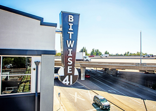
A-Plus Signs (Fresno, CA) fabricated two outdoor neon signs for Bitwise 41.
A-Plus标牌(弗雷斯诺,加利福尼亚州)为Bitwise41制作了两个室外霓虹灯标牌。
In many ways, the two-story, 46,000-sq.-ft. building housing tech incubator Bitwise is a microcosm for the evolution of California’s economy. First opened in 1925, the downtown Fresno, CA structure has been reborn as Bitwise 41 (the number in its name refers to a major freeway that runs adjacent to the building).
在很多方面,这座占地46000平方英尺、两层楼高的科技孵化器是加州经济发展的缩影。加利福尼亚州弗雷斯诺市中心的建筑于1925年首次开放,现在已经重生Bitwise 41(其名称中的数字是指与建筑相邻的一条主要高速公路)。
“Bitwise likes to call itself ‘the mothership of technological education, collaboration and innovation,’” said Jeff Ashlock, owner of A-Plus Signs in Fresno . “They have bought several old buildings in downtown Fresno, renovated them, and filled them with tech startup and other entrepreneurial and training companies. This is our third major project with them, and there are a couple more on the horizon.”
“Bitwise喜欢称自己为技术教育、合作和创新的航母,弗雷斯诺 A-Plus标牌的所有者杰夫·阿什洛克说:“他们在弗雷斯诺市中心购买了几栋旧建筑,对其进行了翻修,里面汇聚了科技创业公司和培训公司,这是我们与他们合作的第三个重大项目,还有几个项目即将推出。”
A-Plus formulated the neon-centric look for Bitwise 41’s two major outdoor signs after receiving a few logo concept designs from the client. “The one they favored most looked somewhat like an exclamation mark, so we continued with that concept, since it seemed appropriate for this project.” In keeping with the Bitwise model of blending the old with the new, A-Plus designed the signs with current aluminum fabrication methods, LED lighting for the internal and halo illumination, and exposed neon for the two double-sided marquee signs. “We felt this was the best fit for a 1920s-era building,” Ashlock said.
A-Plus在收到客户提供的一些徽标概念设计后,为Bitwise 41的两个主要户外标识制定了以霓虹灯为中心的外观,他们最喜欢的那个看起来有点像一个感叹号,所以我们继续这个概念,因为这种风格很适合这个项目,按照新旧混合的模型,A-Plus用当前的铝型材设计制造了标识,内部和光环均采用LED光源,以及两个标识双面都可以看到霓虹灯光源。阿什洛克说:“我们觉得这是最适合20世纪20年代建筑的搭配。
The A-Plus team considered using simulated neon LED for the signs’ exposed letters and borders, but in the end, “We decided that the traditional exposed tube was a more natural fit for these signs,” he said.
A-Plus团队考虑使用LED霓虹灯光源来显示这些标识的字母和边框,但最后,他说:“我们认为传统的灯管更适合这些标识。”
Creating, manufacturing and installing the two, double-sided marquee blade signs with exposed neon, open-face neon channel letters, and internal LED illumination involved using SAi’s Flexi software to guide the shop’s MultiCam CNC router. They used a MIG welder and Accu-Bend sheet- metal fabricator on aluminum tubing, ⅛-in. aluminum skin, a steel frame and supports. All were coated with Matthews acrylic polyurethane paint. White exposed neon tubes powered by France transformers and white Principal LED modules on 12 V power supplies light the signs. A-Plus used a Skyhoist SX70 crane and two Wilkie 52XLR trucks for installation.
制造和安装这两个双面边框标识与外露霓虹灯标识,采用的光源和材料包含有:使用SAI的FLUPI软件进行前期的创建与设计,内部均采用LED光源,多位数控雕刻机,加工铝管使用了MIG焊接机和Accu弯板金属加工机,铝板,钢框架和支架,马修斯丙烯酸聚氨酯漆,法国进口12V电源,白色霓虹灯光源和白色主LED模组。A-Plus最后用一台天启SX70起重机和两台Wilkie 52XLR卡车进行安装。
In conjunction with the Bitwise’s modernization of the building, the new signs have garnered positive feedback about their “fresh/retro” look, according to Ashlock. “The signs offer a big boost in the first impression people get as they enter downtown Fresno,” he said.
Ashlock称,与Bitwise的建筑现代化相结合,这些新标识获得了人们对其“清新/复古”外观的积极反馈。他说:“这些标识大大提升了人们进入弗雷斯诺市中心时的第一印象。”。
With signs like these, we can count on neon remaining the choice for those special customers who can’t resist its look and feel.
有了这样的标识,我们认为霓虹灯标识的外观和感觉,仍然会给客户传达一种令人无法抗拒的独特之美。

Ion Art(Austin.TX)completed this freestanding neon sign for Southwest Theaters.
离子艺术标识(德克萨斯州奥斯汀)为西南影院完成了这个独立的霓虹灯标识。

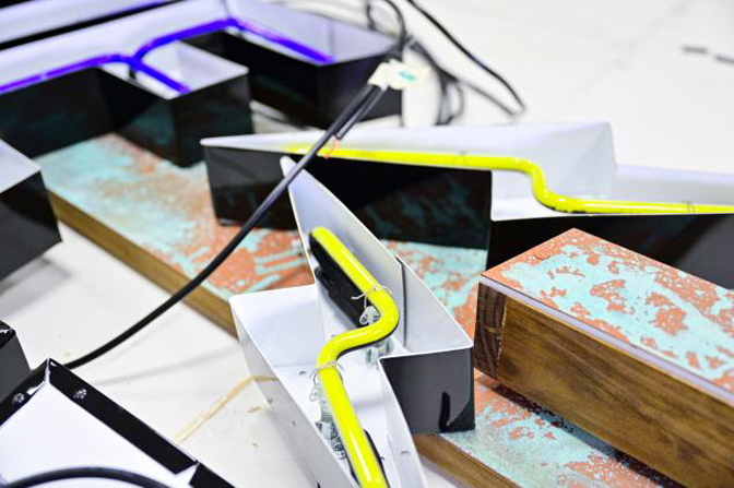
Inside one of the channel letters of the neon sign Creative Color made for its own office.
创意色彩字母为自己的办公室制作的霓虹灯标识。

A-Plus Signs(Fresno.CA)fabricated two outdoor neon signs for Bitwise41.
A-Plus标牌(弗雷斯诺,加利福尼亚州)为Bitwise41制作了两个室外霓虹灯标牌。
