Quint Creative Signs in Piqua, Ohio specializes in designing and fabricating custom dimensional signage. Brian Quinter started up the business part-time on his own back in 2000 before moving into it full-time in 2004. Today the four-person shop crafts stunning custom signs made from Coastal Enterprises Precision Board™ high-density urethane (HDU) that are setting their clients apart from others.
Quint Creative Signs是一家位于俄亥俄州,专门从事标识设计和制作的公司。2000年,布莱恩•昆特利用业余时间进行创业,2004年,他开始全职创业。到今天,昆特团队已经制作出了很多令人眼前一亮的标识,这些标识由高密度聚氨酯(HDU)这种材料制成。
At the beginning of these projects, Quinter will often meet with clients on-site while he surveys the surroundings and takes pictures. These photos help him create mock-ups. He works up these images in CorelDRAW, edits them in Corel Photo-Paint, and exports the bitmap vector artwork into Vectric Aspire where he further turns the artwork into a 3D sign appearance.
在最开始的时候,昆特会在标识安装现场与客户见面,观察周围的环境并拍照。然后利用这些照片,在CorelDRAW这个软件中创建图像,在Corel Photo-Paint软件进行编辑,并将位图和矢量图导出到Vectric Aspire软件中,在那里他将进一步把这些图像转换为3D图案。

“Vectric Aspire allows us to experiment with different textures and 3D element for the signs. We can preview the sign and are able to spin it around and view it from any angle,” says Quinter, noting that he shares this file with his customers for further modifications and approval (either through face-to-face discussions or electronic means).
昆特说:“矢量图可以让我们用不同的纹理和3D元素展示符号。我们不仅可以预览到这个标识,还能旋转进行全方位查看。”他解释说。他会把这个文件发给客户,利用面对面的讨论或视频会议方式,再进行进一步地修改。
The shop’s motto is that if they can design it, then they can machine it with HDU. They use a 0.25-inch ball nose bit on their AXYZ CNC router when creating all the texture and 3D elements, and 0.1875-inch and 0.25-inch end mills for the rest. If there’s need for a beveled edge, they’ll employ a v-carve bit and toolpath. They rarely have any need for sanding or finishing after carving.
“只要能够设计出这个标识,我们就能用HDU材料制造它。”这是他们公司的座右铭。他们在槽刨上使用0.25英寸的球鼻钻头来创建纹理和3D元素,其余部分使用0.1875英寸和0.25英寸的立铣刀。斜边则会采用v形切割位和工具路径。而在打磨或完成后,基本就不需要雕刻了。
Quint Creative Signs typically uses Sherwin-Williams DTM and Resilience paints, however, they also love Nova Color. “Most of their colors are very opaque, and there are very few coats you need to apply,” says Quinter. “For example, if you have a painted black background and need to paint white letters, you can do so with Nova Color in just two coats.”
昆特团队最常用的是Sherwin-Williams公司的DTM涂料和Resilience paints涂料,除此之外,他们也喜欢Nova Color涂料。昆特说:“因为这些涂料大部分的颜色都不是很透明,所以只需要很少的涂层即可。”“例如,如果你有一个黑色的背景,需要绘制白色的字母,你仅仅需要涂抹两层Nova Color就可以。”
They use Sherwin-Williams primer on all their signs. “Primer makes the paint work look much nicer,” says Quinter.
他们在所有的标识上都使用了Sherwin-Williams公司的底漆。昆特说:“底漆会使涂料看起来更加的漂亮。”
The shop has a separate room where they spray the primer and the main base color onto their signs. After twenty-four hours of dry time, they’ll move it to another room to paint the signs by hand.
他们在一个单独的房间里,把底漆和主底色喷到招牌上。24小时后,再把它搬到另一个房间,然后进行标识的手绘步骤。
Three recent projects demonstrate the creativity Quint Creative Signs employs using Precision Board:
昆特团队最近的项目也证明了使用精密板进行标识制作是可行的。
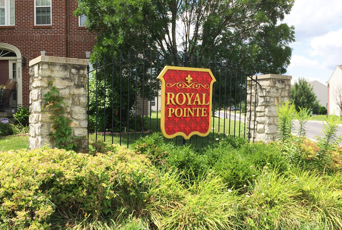
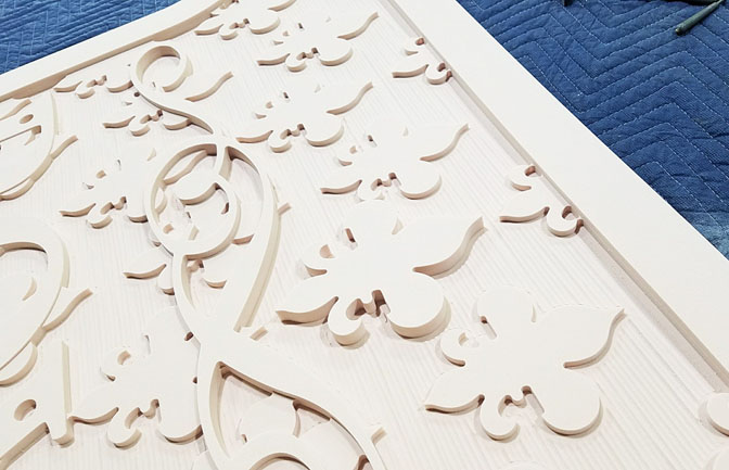
Royal Pointe HMO.
更加高级的标识
Quinter router-carved a brand-new HDU identity sign for a home owners association community in Beavercreek, Ohio.
昆特团队为俄亥俄州比佛克里克的一个社区制作了一个全新的使用HDU材料的标识。
The HMO asked Select Signs of Dayton, Ohio to replace a vinyl-covered Dibond® sign they’d been using on their front gate. Sunlight had deteriorated it over the course of just a few years, and the owners wanted something more high-end that would better match their buildings. “They wanted something more durable they wouldn’t have to worry about over the next fifteen to twenty years,” says Quinter.
卫生组织要求俄亥俄州代顿市的一些公司更换他们一直使用的乙烯基覆盖的标识。因为在几年的阳光照射下,标识变得陈旧褪色,商家想要一些看起来更匹配他们建筑的,更加高级的标识。昆特说:“他们想要一种耐用的,在未来15到20年里他们不需要进行更换的标识。”
His shop got involved after being asked by Select Signs to build it from their design. In fact, they have been doing wholesale work for Select Signs for about four years now.
在这次的标识更换行动中,昆特公司被雇佣根据上面的要求去设计和制作新的标识。因为在选择合适的材料制作标识这个方面,昆特团队有着四年的丰富经验。
Quinter is really excited to acquire more wholesale work nowadays. “This allows us to concentrate on making signs, which is what we love doing,” he says. “There’s a lot less legwork involved with trying to secure permits and performing installs.”
昆特现在很高兴能获得这些制作大量相同类型标识的订单。他说:“这让我们可以集中精力做我们喜欢做的标识。” “因为类型差不多,所以在许可证和执行安装方面的工作量要少很多。”
Select Signs supplied them the vector design, which featured numerous fleur-de-lis patterns throughout. Quinter turned the vector image into a toolpath image carved out on an AXYZ router. The company hand-painted the gold and lighter red flourishes on the sign.
他们挑选了许多带有百合花图案的矢量设计图。然后将矢量图像转换为可以在槽刨上进行雕刻的图像,在标识上面还手绘了金色和浅红色的花朵用来装饰。
Because the sign was going to be attached to an iron fence, Quint Creative Graphics created custom metal brackets for this sign as well. “We used aluminum angle stock and attached it to the sign with bolts,” says Quinter. “The head of the bolts are hidden under the letters.”
因为这个标识需要安装在一个铁栅栏上,昆特团队为这个标识定制了安装的金属支架。昆特说:“我们使用了铝材料做这个支架,然后用螺栓把标识固定在支架上。”“螺栓的接口藏在字母下面。”
For larger signs lifted up onto a building, they’ll typically screw and bond two-by-fours onto the back sides and make a French cleat out of the top two-by-four. “All we have to do is mount and level our French cleat to the wall, lift the sign, and lay it into place,” says Quinter. “We then hide a few screws in the bottom corners of the sign to pin it down so wind can’t lift it off.
如果要把较大的标识挂在建筑物上,他们通常会在标识背面和顶部都钉上八个螺丝钉。昆特说:“我们所要做的就是把我们的标识挂在墙上。然后我们在标识的底部角落里藏了几颗螺丝钉,把它固定住,这样风就不会把它吹走了。”
“Any way we go at it, we always hide the fasteners.”
也就是不论如何,我们都需要把固定标识的零件隐藏起来。
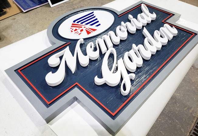
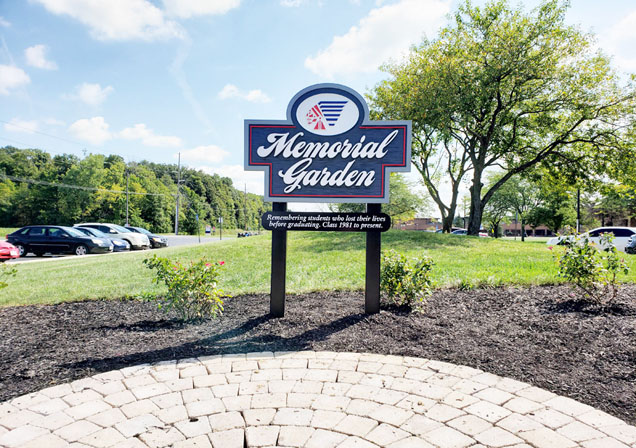
Piqua High School Memorial Garden.
Piqua高校的纪念花园标识
School officials contacted Quinter, inquiring about a sign for their new Memorial Garden in front of their campus. This garden represents every student who passed away before graduating from the school. Their names and would-be graduation dates are etched into the brick walkway.
学校领导联系了昆特,希望他去制作校园大门前的纪念花园标识。这个花园是为了每一个在毕业前去世的学生建造的。他们的名字和即将毕业的日期刻在镌刻到人行道上。
However the previous Memorial Garden had long been neglected and wasn’t getting noticed. Thanks to an influx of grant money, administrators decided it was time to develop a new garden with a more noticeable new sign. “They wanted the sign to be classy yet still fit within the theme of the school,” says Quinter, explaining that his shop designed this sign from scratch after receiving input from the school. “The Indian head is the school’s logo.”
之前纪念花园因为资金问题一直被忽视,现在有了大量赠款,所以学校领导决定为这个花园定制一个引人注目的标识。昆特说:“他们希望这个标识在吸引人的同时又符合学校这个主题。”昆特的公司在收到学校的</sp
