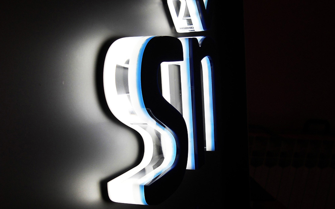
Backlit channel letter signs are mounted away from the wall, which causes the LED modules to form a halo effect from behind the sign. These types of letters not only add an elegant look above entrances, in exhibits, or on monument faces, but also avoid unnecessary light pollution.
背光字形标识被安装在远离墙壁的地方,这就使得LED模组需要从标识的背面发光。这些形态各异的发光字不仅可以使用在展会或者纪念馆的出入口处增添亮丽的外观,更可以减少不必要的光污染。

“From our experience, upper-scale store fronts, in particular boutique, premium-positioned restaurants, and hotels that want a subtle, sophisticated branding look without ‘blaring’ [it] out, are ideal for halo-lit channel letters,” says Kenan Hanhan, president of Provis Graphic LLC, a European company now moving into the North America market. “There are also great applications in interior place-making/experiential environments—from museums to theme parks.
普罗维思公司董事长柯南韩韩介绍说:“根据我们的经验,高端店铺的门面,特别是精品时装店,高档饭店与酒店,比起单纯的炫丽奢华,更想要的是巧妙复杂的外观标识。背光发光字是一个完美的解决方案。从博物馆到主题公园,背光标识可以很好的被应用于场所内部的氛围营造。”
“A lot of it also comes down to simple aesthetic preference.”
“人们选择背光标识的原因很多,但很大一部分还是由于个人的审美偏好。”
To achieve the appropriate backlit aesthetic, Hanhan says lighting designers should question their wholesale letter manufacturer-suppliers to find out which way their LEDs point. “The best halo light diffusion quality comes when the diodes point toward the inside of the face of the letter, reflecting the light back to the mounting surface,” he explains. “This increases the light wavelength before it hits the mounting surface and avoids the unsightly reflection of the diodes off of the mounting surface.”
为了取得合适的背光美化,灯光设计师应该询问他们的LED光源供应商,以找出他们的LED的特点。韩韩解释说:“最好的光源扩散品质是,当二极管在字母背面发光时,再将光反射回安装表面,这大幅增加了反射至字母表面前光的波长,避免二极管在安装面出现不美观的反射。”

Colin Woodford, marketing associate at LED kits and fixtures manufacturer GE Current, A Daintree Company, agrees that LEDs pointing inward results in an even or diffuse halo effect. “Spacing the modules evenly can also assist in attaining even illumination,” he says.
达特里公司所使用的是通用电气的LED套件,该公司营销助理科林·伍德福德,也表示LED发光时会在内部出现均匀或扩散不同的光源效应。他建议:“将LED模组与模组之间均匀得隔开,会有助于达到均匀发光。”
Woodford adds that since each project a lighting designer encounters is different, it’s difficult to generalize halo-lit advice for LED placement inside or behind the letter; however his company has made some observations. “Placing LED modules on the back of the letter, recessing them in a channel on the back of the letter, or placing the modules on a clear/diffuse backing facing into the letter are the most common,” he states. “If it’s a smaller or more challenging application, placing the modules on a clear backing and having them face back into the letter will likely give more uniform results.
伍德福德补充说:“由于灯光设计师会遇到各种不同的项目,很难决定出到底要将LED放在发光字的内部还是背面。”不过,他的公司通过观察资料依然总结出了一些经验。 将LED模组放置在字母背面的凹槽中,或将它们放置在字母的正面与背面上,这些情况是最常见的。如果是在体积比较小或者安装起来比较具有挑战性的使用场景里,那么根据实际情况将模组放在相适应的背景上,或将它们安装在字母中,可能更为合适。
“You can also play around with how far the modules are positioned from the edge of the letter to change the effect of the halo, as well as modifying the distance between the sign and the surface that it’s mounted onto.”
你还可以试着调整模组在字母边缘的安装位置,改变光源的效果,更好的调试出标识与安装面之间最合适的距离。
The size of the letter(s) and its distance from the surface will also have an effect on LED placement. “Generally letters deeper than about three to four inches may require two strings of LEDs to achieve uniformity,” says Woodford. “Another option, depending on the letter set, may also be to place the modules on the back of the letter faces, facing the wall/surface the letters are attached [to].”
字母的大小,与安装表面的距离也会对LED的安装产生影响。 伍德福德解释说:“一般看来,深度超过3到4英寸的字母可能需要两副LED模组才能达到均匀性。还有一种方案,则取决于发光字整体的样式,可以将模组正对安装表面,装置在字母的背面。”
The distance between the letter set and the mounting surface will affect the halo look and the amount of light that must be used, and it’s because of this that Hanhan stresses the importance of optimizing the mounting distance.
发光字和安装面之间的距离将影响光源的外观和需要使用的光源数量。正因如此,韩韩多次强调了优化两者之间距离的重要性。
“Of course, there are so many variables here—including the size/depth of the letter, the type of mounting surface involved, and whether the sign will be viewed at a close distance or not,” he says. “[But] typically we find that standoff distances ranging from 3/8-inch for small letters viewed up close to up to 2.4 inches for larger, deeper letters work best.”
他说:“虽然其中包含着众多变量,比如字母的大小与深度、所涉及的安装表面类型,以及标识是否会在近距离被观看,但是通常为了保证正常的阅读,支架的长度一般在3/8英寸至2.4英寸,深色的字体表现最佳。”
Mounting hardware should be placed in the area the modules are placed and not located along the outside of the letters (as doing so may block light). “Placing the hardware in the middle of the letter will eliminate the possibility of shadows,” says Woodford. “If this cannot be done, the modules will need to be placed strategically to minimize light blockage.
安装使用的配件应放置在模组的区域里,而不是放在发光字的外部(因为这样做可能会遮挡光线)。 伍德福德说:“把配件放在字母中间将消除出现阴影的可能性。如果无法做到这一点,则需要将模组置于合适的位置,以尽量减少光的阻挡。”
“More modules may need to be added to eliminate shadowing.”
“可能需要增加更多的模组以消除阴影。”
There are several other things lighting designers can do when playing around with the look of backlit illumination.
还有一些灯光设计师可以对背光标识的外观做出调整的方法。
“Colors that contrast with the letter itself, if illuminated, can make the sign stand out,” suggests Woodford. “Changing the mounting distance can influence the look; do you want a tighter halo or a softer, cloudier halo?”
伍德福德表示:“如果点亮与发光字本身颜色形成对比的色彩,可以使标识脱颖而出。改变安装距离会影响外观,这根据需要更亮的灯光还是更轻柔的灯光来决定。”
If you’re looking for something softer, Woodford says that you can increase the distance of the LEDs away from the mounting surface to do this. “You can even look at the surface material the letter set is mounted to,” he says. “Different surfaces will disperse the light differently, giving different effects. Try to stay away from an extremely reflective surface though; this can act like a mirror and show the LEDs.”
伍德福德说:“如果需要更轻柔的灯光,可以通过增加LED与安装表面的距离来实现。 增大的距离甚至可以让人看到安装表面所使用的材料 。不同的表面会以不同的方式分散光线,产生不同的效果。不过,要尽量远离反光极强的表面,这些会像镜子一样让人看到内部的LED。”
So are there differences you need to consider when designing halo-lit LED channel letters that are going to be installed above the sight line of the public as opposed to eye-level?
因此,将发光字安装在人们视线之上而不是与视线水平时,在设计上是否需要考虑不同之处?
According to Hanhan, the biggest differences are the type of letterform used and the length of the standoffs. “When letters are viewed up close, we like the precision look of cast block letters that cast a great halo at short standoff differences, so the standoffs are also not as visible,” he says. “Traditional trim-capped letters or even trim-less fabricated painted aluminum or stainless steel letters don’t look as attractive close-up in our opinion.
韩韩认为,最大的差异是使用的字体的类型和安装支架的长度。他说:“当发光字被近距离观察时,我们喜欢使用大写字体,在短支架间投射出的巨大光晕可以让支架变得不明显。传统的镶边字体,甚至是不镶边的铝制或不锈钢制成的发光字,相比起来并不符合我们的需要。”
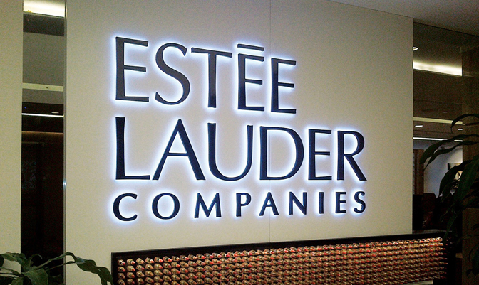
“Also, when looking at halo-lit letters above the sight of line, you can get away with longer standoffs (to optimize the halo diffusion), because the standoffs are not as noticeable at that distance.”
“此外,在制作处于视线上方的发光字时,则可以用更长的安装支架来优化光源的扩散,因为在这段距离上支架不会特别明显。”
Woodford says that GE Current always recommends testing the design before proceeding too far into the backlit fabrication process. “If possible, be sure to view the test sample while standing at least twenty-five feet away in the dark,” he advises.
根据伍德福德介绍,GE公司会在进入背光制造过程之前对设计进行测试。 他建议:“如果条件允许,尽量在黑暗的环境中,距离至少25英尺处查看测试样本。”
Hopefully the preceding advice gives you some backing to help make your next backlit project a glowing success.
希望本文对于的介绍与建议对您所做的背光项目有所帮助。预祝您的事业成就辉煌。


